Color Schemes: July 14-21, 2022
The Mission:
Illustrate the same thing four times using monochromatic, complementary, achromatic, and analogous color schemes. Subject and medium are your choice. More info on each scheme below and here.
Monochromatic color schemes are derived from a single base hue and extended using its shades, tones and tints. Tints are achieved by adding white and shades and tones are achieved by adding a darker color, grey or black.
A complementary color scheme is composed by using two colors opposite each other on the color wheel.
Achromatic color schemes use black, white, grey, and other neutral colors in combinations.
An analogous color scheme is three colors that sit next to each other on the color wheel, with one being the dominant color, which tends to be a primary or secondary color, and two on either side complementing, which tend to be tertiary.
The Submissions:
by Espy la Copa


I have been thinking about the symbolism in tarot cards a lot recently, and today it's the Temperance card (Rider Waite Smith deck). An zen angle stands with one foot in water, one on land, pouring water from cup to cup, the path of life stretching behind into the sunset.
Circle, square, triangle...a couple of wavy lines (this isn't your lucky day). I've heard it suggested that square is body; triangle is mind; circle is spirit. All should be in balance and if you let one area fall behind, the rest will suffer. Life is a balancing act of continually adjusting the water in our cups, taking from that one to feed this one so we don't fall apart into a glorious human mound of sadness and failure. (So keep filling your spirit cup with these art projects!)
Breaking this card down into shapes was a fun exercise in memorizing that lesson. Adjusting the color scheme is a great reminder that every day is a different color, and we need to live in the grey days just as much as we need to live in the purple and orange days.
by Captain Quillard


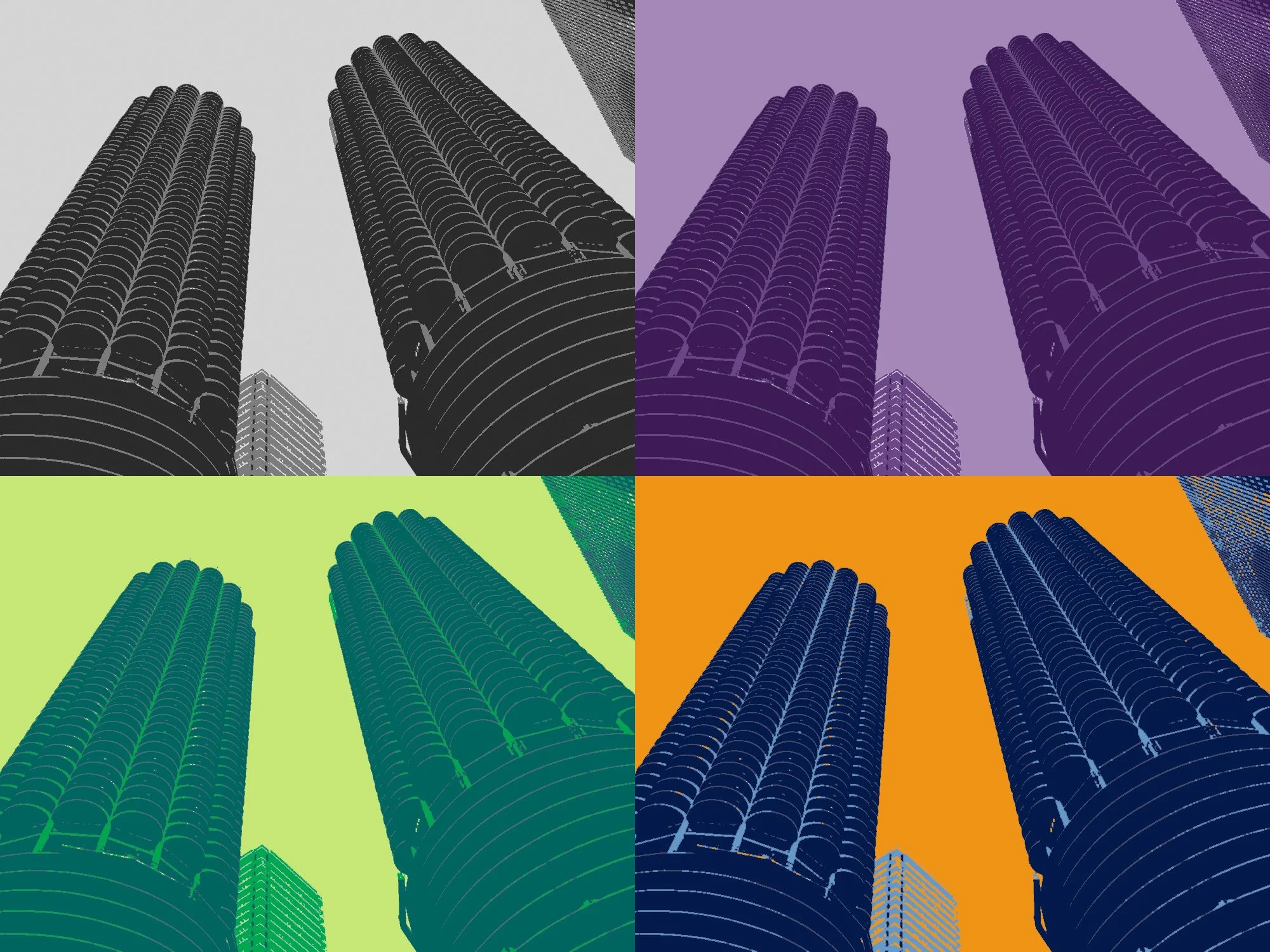


I had fun playing around with some old photos I had taken, breaking them down into a three- or four-color scheme first, and then recoloring them with the various color schemes. It got to be addictive, and it was interesting to see which photos worked better than others with this process.
by Heart of Darkness

I'm back now that summer classes are over! And in true teacher fashion... I illustrated a summer reading list - in color.
“POW” - by Soldier Clinging to Helicopter
Next Week’s Assignment:
This one is taken verbatim from Sarah Urist Green's You Are An Artist: Assignments to Spark Creation, which I use with my students and highly recommend. This particular assignment was created by contributing artist Nathaniel Russell, and it's called "Fake Flyer." The instructions:
"The flyers you see tacked to bulletin boards and telephone poles are almost always practical, advertising events, causes, and available services. Here's your chance to create a flyer that is impractical. Loosen up, unleash your imagination, and begin to conjure all the strange and wonderful reasons why someone (or something) might want to communicate with others. Make a flyer that gives advice, shares something about your life, or promotes an imagined event."
